A tale of two apps
Since November 2009, I have been working with the talented people at BERG London on a variety of projects, two of which I want to mention in more detail here.
Michel Thomas on the iPhone
The first project was the Michel Thomas iPhone app. This is one of the most well-rounded apps I've implemented, and proves that you don't need a large team in order to produce an intricate and attractive application. BERG's supremely talented designer, Matt Brown, designed the visuals, and I worked on the iOS implementation. Between us we came up with a product we're both very proud of, and it's now the flagship mobile application of Hodder Education.
Since its launch, the Learn a language with Michel Thomas application has been steadily gathering interest, and It has recently taken the top spot in the Free Education category of the App Store, both in the UK, and in the USA and Australia.
There are more details of the design process in the "Behind the scenes" post that Matt Brown wrote up for the BERG Blog, and a comprehensive Flickr image set of the sketches we created during the design and development process.
In my view, one of the standout feature is the playfulness we worked into the interactive audio player. We went through a number of design iterations, many of which were discarded because the technical implementation didn't capture the feeling of the original design sketches. Our final design struck a great balance between gorgeous design and the constraints of the real-time rendering power on iOS devices.
At the height of the work on the audio playback, I listened to the same phrases so many times that Michel Thomas percolated through into my subconscious. At one stage, during a particularly intense week of work, he took a starring role in a dream, chatting up girls at a party in his uniquely accented Spanish!
Popular Science+ for the iPad
The second application we worked on was Popular Science+ for the iPad. BERG had previously worked with Swedish publisher Bonnier in late 2009 on an exploration of the future of digital magazines. Very shortly after the Mag+ video had been released, Apple announced the existence of the iPad, and Bonnier, along with BERG, were invited to create the magazine experience that had been conceptualised in the earlier work.
The challenge of bringing Mag+ into the world in only 8 weeks made it an extremely ambitious project, which took a great deal of concentrated effort from many people across numerous timezones (London, Sweden and Florida, USA). Thankfully I was joined by another developer, Lei Bramley, who really pulled out all the stops to get everything in place on time.
After a fevered period of development, we submitted the first version of Popular Science+ to the App Store for the launch of the iPad, and Steve Jobs himself had very nice things to say about our work:
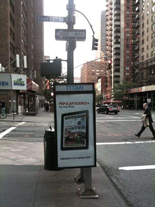
Somebody snapped this picture of the street-level advertising of Popular Science+ while out and about in Manhattan:
The sheer ambition and timescale of the project saw everyone involved in the project raise their game, and it was a fantastic experience to have been part of the iPad product launch.
Mill Colour
Lastly, a small update concerning Mill Colour. What began as a small project to give people a taste of professional colour grading, has gone on to be a big success worldwide. It has been downloaded over half a million times to date.
Viva Mill Colour!
